Showing posts with label Process and Production 1. Show all posts

Thursday, 4 May 2017

Typography Transcription - Final

We have here the last physical studio session with John today, and it's all about creating and finalising our font. I enjoyed the previous two sessions because I got to explore and experiment with different fonts and now I will create a full alphabet on just a singular font. So far I liked the simplistic, clean and symmetric look for my font so I will be using this theory and putting it into practice on my font. Here are the images for my final font:


The creation of this font went well. I used an ruler and grid paper to create lines that would form into each letter in the alphabet. I kept it symmetric and clean just how I wanted and I quite like the simplistic effect with the font. The grid paper helped drawing up this font because I was able to reference each point so I knew where to draw. It also helped me space it out equally so the aesthetics look pleasing. The rounded shapes like the O and Q were probably the toughest to do but I managed to do it nicely by taking my time and completing it in my own free time. This enabled me to get the best results with my font.


Monday, 1 May 2017

Cinema 4D

In today's last CC suite, we had Stephen introducing Cinema 4D. We started watching an introduction video that demonstrates how Cinema 4D is used in reality, and there was some amazing examples. It's used a lot in the design industry and it has a lot of different purposes you can use it towards. This is a show reel demonstrating how well Cinema 4D is used in the industry.


So in this workshop, we were going through different tasks and exploring the interface of this new software. Here are some screenshots below of some of the tasks:


This is a packaging task where we experimented with the interface, You can zoom in and out of the shot. The packages are made up with textures.


This is a little animation that was created of a cloner spinning. We changed some of the properties, added a light and made it our own. The animation I made will be down below.


This is the independent bit where we create our own text and make a short animation. I decided to use the word 'HYPE' perhaps because of the mood during this session. After all, we were just going with the flow and it was all fun and chilled. I liked the look of the 3D text so I will be turning this into some sort of animation.


Just before I decided to render my video, I added a texture and a gradient background which gives it a nice clean look. Using the texture and pattern just made the render extremely low. So I changed the settings to low resolution and rendered it eventually. Here are the two videos from the workshop:

Cinema 4D - Cloner Spin from Faisal Islam on Vimeo.

HYPE - Cinema 4D from Faisal Islam on Vimeo.


Thursday, 27 April 2017

Year One Finale - Collaborative Film

I present you the last After Effects workshop. This session, we created a 10 second animation with the theme of 'Sky'. We had to create any object that flies through the sky from right to left. Then we collaborated as a group and put all our work in a compilation. For this animation, I designed an alien on Photoshop, which was made up of different layers to enable some animation effects. I also included some skies. The colour code was set for everyone's work so there's some consistent theme throughout. Here are some screenshots from the session:


So continuing the usual routine, I saved this PSD file and imported it into After Effects. Then I set up my composition and organised how I want my frame set. I added animations to the alien and the sky. We had to ensure it starts off as a blank blue background and also ends the same. This way, the next student's work would flow in. We set up a Null object on our creations and that determined the movement from right to left. The best feature I liked on my animations is the way the sky drops down and goes up. I liked the effect it gives introducing a crazy alien in the sky. Once I was happy with my animation, I rendered the animation in a way that the background was transparent so it can be put together. We then shared our animations on the server which got put together by Sara.


To end our final session, we had the opportunity to end it on a good note and watch all of our animations. Throughout the year, I've learned so much on using After Effects coming from a background with no experience in it. It has been fun almost doodling around on After Effects and just having the chance to do some explorations. Below is my animation for this session, and also the group animation that we completed.

The Skies from Faisal Islam on Vimeo.

Group B Finale - 16:40 from Motion-go on Vimeo.


Typography Transcription - Development

This second session on Typography Transcription, we created full alphabet designs that was influeced from our references. I was working on this graph lined paper which is slightly different from the last session. I also used tracing paper so my design looked clean. Here are some images from the workshop:


Here is one font I roughly finished that was influenced from the first session. I noticed as we was drawing out each letters, some were more challenging than others. It was a good problem solving task that we completed. I like the simplistic, ruler look so neatness for this design was key. However, the design below is more freehand. As you can see, that is the image where I got my influences from with the curves. To make this font better, I would of added colour but I quite liked the greyscale look. This font wasn't too hard to draw and the letters were decent and equal in size.


It was another good session drawing up the full alphabet. The next session will be the final transcription workshop so it would be interesting to see how my final font looks like. I think I will stick to the ruler method because I'm not so confident with my drawings so doing it freehand just doesn't look as good as a smarter font.


Typography Transcription - Ideas

In this second semester with John, we will be creating our own fonts in these post and production workshops. We looked at some examples of fonts that were created and spectated on how they used their piece of influence in their work. Using some references of our own from some images, we created letters from the shapes we looked at in these images. To begin with, we started drawing out the letters "A,N,E,S,G". I decided to do this on graph paper because the grids were helpful in presenting the font neatly and to keep the lines consistent. I experimented with using pencil, markers and fine liner through the day. Here are some images below from the workshop:


In the images above, you can see where I was influenced from. I tried not to replicate the font but to however have the filled look. I also kept it simple and just filled the letters with a black marker. This was a good starting point because I've never sketched or designed my own fonts before, so it was a fun new experience for me.


Here is another style I was picking up. I liked to use a ruler drawing my lines so that it looked clean and equal. This style is simple yet it was starting to pick up bits from this reference. The idea was to draw circles within each character or zig-zag lines on the harder letters that aren't filled like a 'C'. This font and reference also reminded me of American Horror Story styled font which I'm familiar with.


These are some more experimentation I was doodling with. I brought some colour into my sketches and thought about the direction of the marker. I was also able to control the fill depth and I think this technique could be good to create bubbly text. The fine liner text was another exploration using simple lines to create this 'The Great Gatsby' look. After we had a go at drawing, we all put our work up on the board and had a look at everyone's fonts. I thought it was a good way to end the day getting some positive compliments as a group.


Helvetica

Today's process and production session with Rob was about extending our knowledge of Adobe Indesign. We had to put our thinking caps on and think of concepts for a design publication. From the lecture on deconstructing Helvetica, our work was scanned in so we can use for this session. Working in a group of 3, we created a design publication in black and white, included the interior pages of our designs working with the specified dimensions. This practices our designs and outputting client-ready PDF files with bleed and crop marks. Here are some images from the day:


Here is some of our initial sketches of ideas for the front and back cover of the publication. Working in the group of 3, we aligned ourselves tasks on specific areas to work on time. Below is an what we came up with having this simplistic style in mind. Using shapes on Indesign, we came up with a H abstract ensuring it's equally measured.


After looking at some inspiration of ideas, I thought the idea of this glitch code effect would be quite a cool style so I used The Matrix glitch as a reference for the idea below.


I liked how this looked because the text is spelling out Helvetica in a technical error order. I also had the text overlap so it gives it more of an effect of a glitch. I also ended the last line with Helvetica which is in Bold so it stands out. Overall, this session was interesting to play about and see each others work put together. It gave us the opportunity to work in groups which gets us all communicating as a team. It briefly helped me expand my knowledge on Indesign compared to the very beginning.


Kinetic Type 2 - (Z-Space)

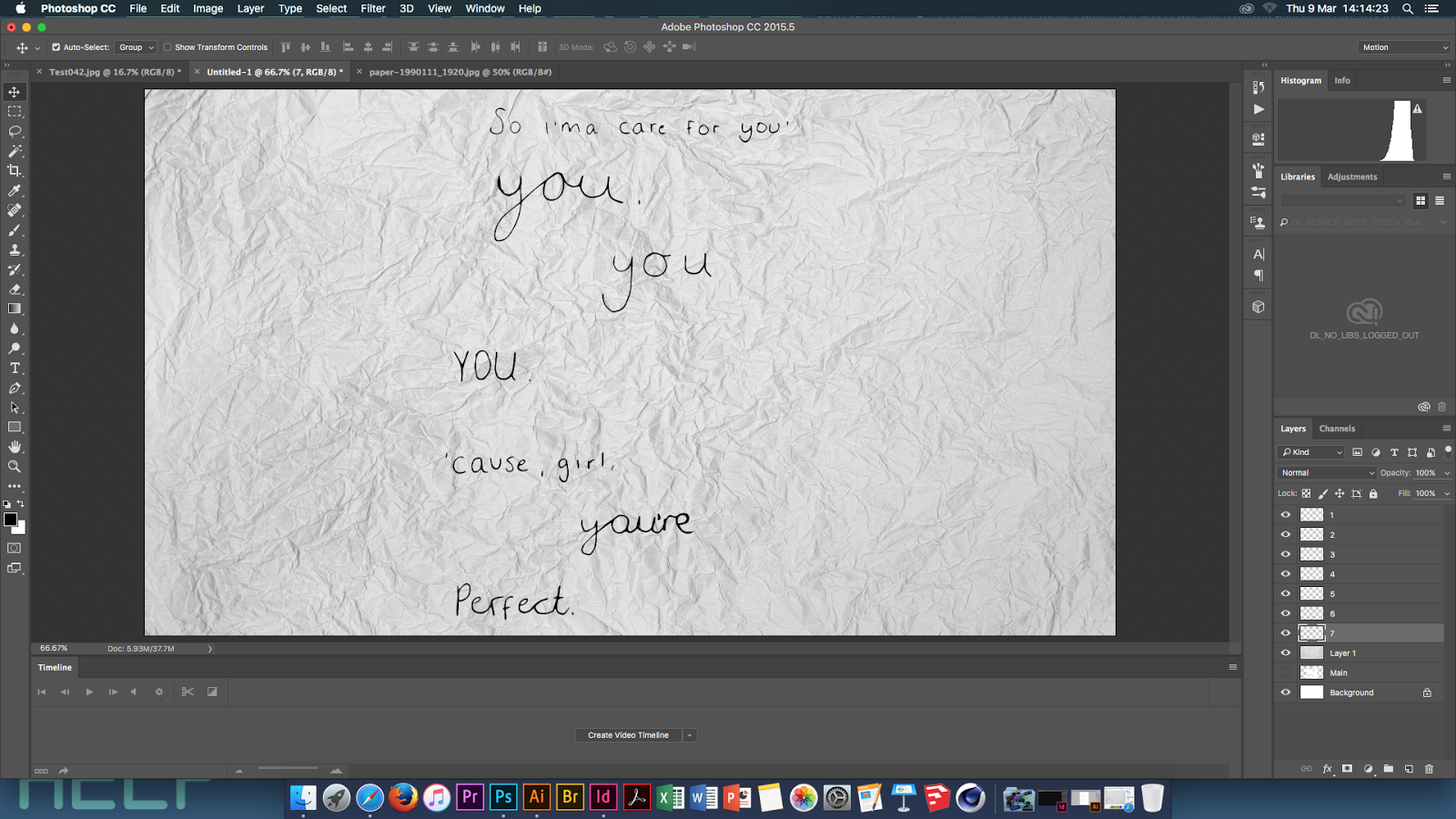
In this After Effects workshop, we will be creating a Kinetic Type 3D space animation. We drew and brought in a set of song lyrics. I've selected the chorus for Earned It which was sung by The Weeknd. I selected this song because it linked with my essay and it brings my own interest of music into this fun workshop. I've drawn it out so it looks handwritten. Here is the drawn image of the lyrics:


Opening the scanned version on to Illustrator, I used the image trace tool to change the threshold. This enabled the lyrics to look and become more darkened, which looks more digitalised. Then I pasted that edited version on to Photoshop which was set up on the right pixels, working on 1920 x 1080. I began to start breaking up each word into layers. This is crucial for this to work because our video would be going through each word, through space.


So after having each layers all split up, I started looking for a free copyright background which I've screenshot and attached below. I selected this scrunched up look because it would look cool having the lyrics come out and move around on the page.


Preview of background with lyrics

After having all the components ready for this kinetic video, I saved my Photoshop as a PSD file and imported it into After Effects. After creating a new composition like in the previous tutorials, I placed all my layers and started to add animations to each layer.


Now the significant bit in this workshop is the use of camera in After Effects. Once I was happy with my text animations, I created this camera which enables us to control the direction the video is directing towards. After multiple editing time, Here is my final video below:

Song Tribute from Faisal Islam on Vimeo.

Friday, 10 March 2017

Physical Studio - Still Life

This workshop with John was about sketching still life. Unfortunately with my tonsillectomy, I missed this workshop so I did a catch up and did my own still life drawings. During these times, I was drinking a lot of McDonalds milkshake to soothe my throat so I decided to sketch the McDonalds cup. Here are the sketches:

Original


Here are the initial rough sketches I was aiming for, I wanted to catch the curves on the lids caused by shadows in the image. I decided to then highlight the M using a highlighter in the images below.


Here are small still life images using a fine liner. I wanted to focus on creating these miniature versions of the cup. I thought this idea was cool and was inspired by some drawings on Pinterest. It's focusing on line and I like the empty spaces around the drawing,


Thursday, 9 March 2017

Interactive PDFs

In this Indesign session, we created interactive PDFs. This included us creating interactive buttons in the form of shapes, text and video stills. I found it interesting the way we can make PDFs interactive where things are on loop or if you hover over then it can change colour. Moreover, here are some screenshots from the session: 


Kinetic Typography Film

The fourth workshop for our after effects tasks is this font tribute. This is a 10 second animation introducing a font I've selected called Orator STD. The animation is just below:

Orator STD (Font Tribute) from Faisal Islam on Vimeo.

I believe the animation went extremely well and I learned new skills during the making of this short animation. It started off pretty simple and as the workshop continued, you can also see how the animation progressed. We started with each frames designed on photoshop which was then dragged over on to after effects. The main element I found very interesting and fun to use was the animation on the text itself. Here is a screenshot below of which frame I'm referring to. I liked the magnifying style I've added to the word 'Small' which works very well. The composition of each frame is also consistent throughout. The ending was also a new technique I've picked up on, where the frame zooms in and rotates.


This is an example of the screen frame I've worked on in photoshop, which was all saved with layers so I can edit the text itself.

Morpholo Tile Task

This task is an introduction to the Adobe Illustrator, which I've never personally used before. We briefly looked at Morpholo which is a visual tile game. We selected numbers and got aligned some tiles format which we were working on. The idea is to cover the square along with the format. This included hand drawings which we then designed on Illustrator.


Here are the tiles that I quickly sketched out. This progressed on to the shapes I've focused on from some fonts. These shapes are below:


I selected some arabic fonts which has unique alphabets which I focused on. Here is a screenshot when I was playing about on illustrator putting the tiles together. It was a challenging task because we had to fill the tiles and the tiles got harder the higher number we picked. I also think Illustrator is interesting to use and I will hopefully develop more skills from using it.