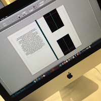
Today's process and production session with Rob was about extending our knowledge of Adobe Indesign. We had to put our thinking caps on and think of concepts for a design publication. From the lecture on deconstructing Helvetica, our work was scanned in so we can use for this session. Working in a group of 3, we created a design publication in black and white, included the interior pages of our designs working with the specified dimensions. This practices our designs and outputting client-ready PDF files with bleed and crop marks. Here are some images from the day:
Here is some of our initial sketches of ideas for the front and back cover of the publication. Working in the group of 3, we aligned ourselves tasks on specific areas to work on time. Below is an what we came up with having this simplistic style in mind. Using shapes on Indesign, we came up with a H abstract ensuring it's equally measured.
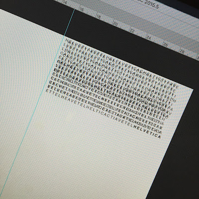
After looking at some inspiration of ideas, I thought the idea of this glitch code effect would be quite a cool style so I used The Matrix glitch as a reference for the idea below.
I liked how this looked because the text is spelling out Helvetica in a technical error order. I also had the text overlap so it gives it more of an effect of a glitch. I also ended the last line with Helvetica which is in Bold so it stands out. Overall, this session was interesting to play about and see each others work put together. It gave us the opportunity to work in groups which gets us all communicating as a team. It briefly helped me expand my knowledge on Indesign compared to the very beginning.


