Showing posts with label Theory as Practice 1. Show all posts

Sunday, 7 May 2017

Sketchbook Lecture

In this lecture, we had guest lecturer Jay Payne talk about using sketchbooks in our practice. Here is the notes from the lectures:


Sketchbooks as research
A Bridge between Theory & Practice
—————————————

Exercise
Use your sketchbooks to make visual notes during the lecture.
Relax & do not censor this process.
This is not a drawing exercise but a doodling one.
My Practice
Graphic Designer,Technical illustrator & Motionographer
Many areas of work - difficult to define
Constantly evolving - Layers of paint – show Website - contextual portfolio
A Polymath - 'A man can do all things if he will' - (Leon battista alberti 1400's)
My Research
About - Visualising the Invisible
Starting point - Show Video
Now - Autoethnographic investigation of my sketchbooks
Moving towards - Meta Reality - Drawing things that dont exist
Theoretical Context
Confrontations with the Unconscious
Jung - 'Taking inner life seriously' - reinforcing the sketchbook
Mandala / Tarot as a device for mapping the inner world
Deleuze & Rhizomic learning
Discoveries
The difficulty of Research for Creative practicioners
Breaking the rules - A natural resistance to established dogma
Exploring the Nowhere (boundary) - the edges of the real - show Video
Solidity & Fluidity in my practice & thinking
Bergson - Metaphysics - stillness & movement
Eisenstien on Disney - Fluidity in animation. our fascination with the flame.
Zigmunt Bauman - liquid modernity - DIssolving established modernity
Relevance
How is this useful?
The importance of sketchbooks
The importance of Exploration & continued learning
Removal of solid thinking - the 'Am I allowed?'
So how do I get an A?

To sum up this lecture, we learnt that sketchbook is a very powerful way of working because you can jot down any ideas straight away. The process of is it wrong doesn't matter because it's all about developing the ideas. He showed us his website and went over all the pieces of work he has created/ Most of these are based on drawings in sketchbooks and a lot was just self taught. This was pretty interesting because the only technique was to use a sketchbook to begin with.


This is an example of a mixed media sketchbook. It's just a visual example of what a sketchbook could look like. There isn't a rule where it has to be neat and professional, it can even be scribbles. It's a way of just letting you draw with no control over how perfectionist it has to look. I quite like the look of a sketchbook that is all rough because it shows that there's so much ideas, thoughts and considerations going on. It's a way of collecting those and just putting it down on paper.


Animation Heroes

In this lecture, we were looking at animation in depth. We began doing a quiz on Disney films. tv and games. Then looked into different types of animations and how it effects us and the theories behind each one.

There is a lot of controversy in some of these animations that we just never notice. For example, Yogi Bear lives in a safari park but steals picnics. We also looked at sofa satires such as Family Guy and The Simpsons which both are very popular and recognised. These shows tackles a lot of press in the news in their own satire way.

Then there was girl culture where there's franchises of cartoon characters such as Dora the Explorer which is an example that created merchandise and it's mainly about making money.

South Park is the uncut version of a satire, they deal with serious and bold subjects to pass on a message to the audience. It's very much always up to date with the news and they embed that in their show.

It was interesting looking at all these various examples of animations and how much we look into it as we're grown up. There is a lot of adult humor embedded within these cartoons which we never used to understand. There's also a level of animation of how realistic the characters can look. For example, Tomb Raider is an animation that looks very uncanny and realistic compared to Spongebob Squarepants which is just animated shapes.


Post Modernism

This is another catch up post on Post Modernism. This is a departure from modernism. This includes skeptical interpretations on a lot of subject matters. It's from the late 20th century and it's often associated with deconstruction.


Here is an example of Post Modernism. It is a very skeptical styled poster that is usually political. It's captioned with almost inappropriate terms and it's using different portraits as a mockery.

Design & Emotion

This lecture was during my operation so here's a quick overview of what I've missed. It was about emotional and meaningful communication within design. There was a load of image illusions in the lecture that effect people differently. These are created with different colours, angles and patters that an eye cannot understand. We filter these and make sense of what's happening differently. Our eyes can deceive us. Here are some examples of illusion:


This is an example where we get tricked with the angle. Our eyes are deceived because the outline is a face on both sides. It looks like it's the center then from the left. There are many illusions out there and it's just a quirky way of understanding different perspective within graphic design.


Here is another eye tricking image where some people can read this. It's the right letters all jumbled up but our eyes process all this information enabling us to still be able to read this. As it says, if the first and last letters are in the right position then we are still able to read it all. That is how fast our eyes and brains react when we read something.


Type

Typeface or font? So similar yet so different. Typeface is referring to the design of the collection. Whereas font is referring to the collection of letters, numbers and symbols. In other words, fonts put together make up the typeface. In the lecture, we looked at Jan Tschichold's The New Typography which had some principles about utilising white space and having the element balance of symmetric for the font.


‘The physical embodiment of a collection of letters, numbers, symbols, etc. (whether it’s a case of metal pieces or a computer file) is a font. When referring to the design of the collection (the way it looks) you call it a typeface.’ – Mark Simonson, designer

I found the next bit interesting when we looked at Herbert Bayer's Universal Alphabet (1925). This font had no capital letters and looked very modern till this day. Bayer was a student at the Bauhaus school and created this in 1925. For some strange reason, the letters G and K was highlighted which we can't explain. The typeface was easy to read and it focuses on the geometrical shapes on the font. This featured the bauhaus elements of perfect circles and lines which was known through the Bauhaus research in the previous post.


Along the lecture, we started looking at kinetic type which I found interesting, seeing type visually pleasing with some animation and movement. This video below is one of the examples from the lecture that I liked the flow of. I thought this video was a good example to demonstrate how kinetic type works. This also ties in with our post and production workshops we do, experimenting on kinetic typography. 


29 WAYS TO STAY CREATIVE from TO-FU on Vimeo.

It is clear to say that movies and tv shows also use a lot of kinetic type for the opening and ending credits which we've seen examples of. Here are some independent examples of kinetic type I've been looking at:


Scream | Kinetic Typography from Nicolás Funes on Vimeo.

This kinetic typography was created based on the Scream franchise. They've selected the traditional phone call dialogues and created this kinetic video that interacts with the dialogue. I like the composition of this video with the colours of black, red and white which represents Scream. I selected this video because I grew up watching this franchise and it's great how you can tie interest with designs. This will keep my head open minded when it comes to doing work, relating it to me as much as I can.

In the seminar, we cut up these 10 shapes and created our own fonts. Here are some of the letters we created below during the seminar:


Tuesday, 11 April 2017

Manchester Trip

This Friday we headed over to Manchester with a coach to visit a few galleries. It's been a pretty decent trip and the gallery was interesting. There were some artists work that we could relate to such as Idris Khan who we've looked at during lectures. Here are some of my phone photography from the day:


Iconography

This is the final theory as practice lecture for the year. This was about Iconography. Iconography is Greek for image and to write. It's the study of symbols in a piece of work or design. These symbols are easily recognisable and is common through different cultures. For examples, an image of a dove, a white flag and a peace logo will all represent peace.
Here are an examples of Iconography that we associate with on our smartphones. These are symbols that are universal that we recognise and are aware of.


Appropriation Part 2

POSTMODERNISM AND APPROPRIATION PART 2:
Pastiche, Parody, Satire & Authenticity

Examples of parody, pastiche, satire in visual design as a way of achieving:
■ Humour
■ Political commentary
■ Critique
■ Layered understanding/engagement
■ Nostalgia


This graffiti is by Banksy which is an example of this postmodernism in 2006. This is actually an example of mockery that is made of Mona Lisa.

We look at adbusters and looked at some adverts that were anti-branding against certain cooperation's. 


This is an example of adbusters against Pepsi. I quite think it's an effective adbuster campaign because they just transformed the logo into a fat person drinking pepsi. There wasn't much to manipulate apart from adding a bellybutton. I think this worked really well because the white gap between the red and blue actually looks like a belly. Adbusters usually try to mock big brands but it's whether consumers want to take it on board or not.


Branding

It's the start of a new term and I am back all recovered from my tonsillectomy. This lecture is about Branding and we'll be looking at big cooperates that we all know. We started with a quiz on naming all these brand logos and it was pretty fun answering those.


A BRAND IS … A visual, emotional, rational image that you associate with a company or product – with an extremely powerful impact on our beliefs, behaviour and emotions.

I found this lecture interesting because I love looking at branding and how we associate a logo with a whole cooperate. It's interesting to see how they all differ from each other and how big a company is. We looked at many examples of ads, posters and idents and overall it was interesting learning about the theory behind branding.

Monday, 9 January 2017

Semiotics

This is a lecture I've missed because of my tonsillectomy pre-op check up. So I did a quick overview on Semiotics.

Semiotics are the theories that explores how systems of sign works to make a meaning. Also how we represent ideas and create meanings using a range of tools like words and images.

This idea of semiotics helps us understand how visual communication works. It brings an understanding how words and images work together to make sense in our minds. For example, if we think of the word dog, we would vision a dog or we'll know what a dog is because that semiotic exists.


This is an example of road signs that is understood universal by car drivers. These sets of signs has a set of instruction or meanings to it that is required to be understood on the roads. In graphic design, a good designer would understand how we associate signs with meaning so we can use this theory and put it into practice.

Wednesday, 2 November 2016

What Is Graphic Design? - Additional

Graphic Design. This is a whole new subject for me. I have previously studied Photography so I was intrigued to find out more about Graphic Design. In order to do so, I went to the library and picked up this book called "What Is Graphic Design?". This book contained some examples of different media's and outcomes that Graphic Design is about. I selected some pages here to show a few, so we have logos, magazines and typefaces. It had some good information on what Graphic Design is, which is pretty much everything in some form or shape. This will get me slightly informed so I know what I could be expecting when we start getting the work. I will be using this book as a guide through my journey.


Saturday, 29 October 2016

Seminar - Thursday

In this seminar, we had a small creating writing activity. Here are my notes from the seminar.

Object: Book

What are they?
- a collection of articles, essays and reviews from the mid 1980's to mid 1990's.

How did you find them?
Purchased from eBay for 1 pence.

Rick Payner: Author of book

[Subculture - Dick Hebridge]

Activity:
A brown bear sat on a white chair.

A lost brown bear sat on a hard white chair.

A lost and confused brown bear sat on a hard white chair.

A lost furry bear sat on a hard chair figured out his way home.

A lost furry bear sat on a hard chair as he couldn't find his way home. Eventually he figured out his way to safety.

Friday, 28 October 2016

Surrealism/The Uncanny Valley

Today's lecture was about Surrealism and the Uncanny Valley. I knew what surrealism is but I had no clue what uncanny was. I thought this lecture was very interesting and found these styles quite daring.

Surrealism - a 20th-century avant-garde movement in art and literature which sought to release the creative potential of the unconscious mind, for example by the irrational juxtaposition of images.
https://en.wikipedia.org/wiki/Surrealism

Uncanny - strange or mysterious, especially in an unsettling way.
https://en.wikipedia.org/wiki/Uncanny

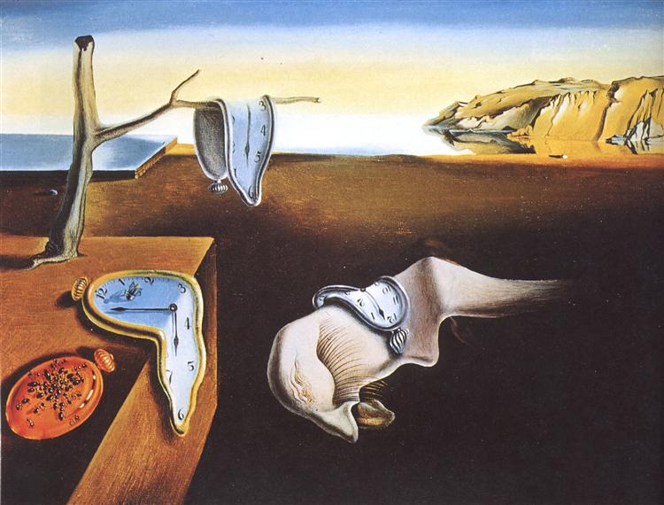
The Persistence of Memory, 1931 - Salvador Dali

Salvador Dali is one of the greatest surrealist artists and this piece of work is from 1931 called The Persistence of Memory. I like how you get a sense of place within this painting. There's the presence of location and the clocks makes it feel unusual considering the location looks nice. I like how the clocks look like they've melting and it just makes the viewer think more theoretically about what it's suggesting. To me, it means that time is priceless and we're only left with a memory which ironically can be forgotten over time.


In comparison, we have an example of uncanny. Uncanny comes from the word 'unhomely' This is an image from Stanley Kubrick's movie "The Shining, 1980". This image of twins becomes strange in an unsettling place because it's unusual seeing twins dressed and looking slightly creepy, in an old fashioned building. I think the location does help with the strangeness because it gives it some context. It reminds me of creepy kids from a mental asylum. Bringing this back to the comparison, you can immediately see the difference between surrealism and uncanny. Surrealism doesn't have to be scary in simple forms, it can just be abstract but uncanny is more lenient towards the creepy side.


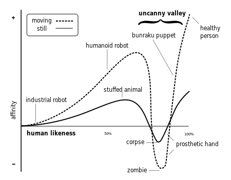
Here is a diagram that shows the level of human familiarity and where things become uncanny. This diagram is called The Uncanny Valley, 1970. It suggests what we're used to seeing and what we may find interesting.

This has been one of my favourite lectures because I enjoyed the theory side to uncanny and seeing various examples of creepy images. It also helps me wonder that I'd use some of these techniques and theory in my own work to create designs that people would find interesting the same way we'd react to seeing a zombie.


Essay Briefing

Today we were given our essay brief that is 50% of the theory as practice module. 1500 words is handed in first which will then because 2500. By the end, there will be 4500 words in total including referencing. We are given 3 essay questions to choose from which we can work on. Here are the questions:
  1. Discuss the effect of subcultures on influential graphic designers.
  2. In what ways have the prequel or sequel influenced contemporary graphic design. 
  3. Brand versus anti-brand. How have graphic designers worked with or against brands, and to what effect?
In this first instant look, I've not made my mind up on which question I want to do but I want to keep my mind open about all three and decide with time.


Inspirational Quote

-------------------------------------------------------------------------


                      "Simplicity, carried to an extreme, becomes elegance."


This is my inspirational quote for design. I'm very fond of simplistic designs because the less you have, the more bold it will stand out. Designs now in this contemporary era, simplicity is used more than ever and it's experimenting till you reach that elegance. Here is an image from the Graphic Design Theory book that I've been using in my own time. It's a page on Contemporary Design that just looks very clean and minimal.


Bauhaus - Form Follows Function

"The Bauhaus was the most influential modernist art school of the 20th century, one whose approach to teaching, and understanding art's relationship to society and technology, had a major impact both in Europe and the United States long after it closed. It was shaped by the 19th and early 20th centuries trends such as Arts and Crafts movement, which had sought to level the distinction between fine and applied arts, and to reunite creativity and manufacturing. This is reflected in the romantic medievalism of the school's early years, in which it pictured itself as a kind of medieval crafts guild. But in the mid 1920s the medievalism gave way to a stress on uniting art and industrial design, and it was this which ultimately proved to be its most original and important achievement. The school is also renowned for its faculty, which included artists Wassily Kandinsky, Josef Albers, Laszlo Moholy-Nagy, Paul Klee and Johannes Itten, architects Walter Gropius and Ludwig Mies van der Rohe, and designer Marcel Breuer."


This week's lecture is about Bauhaus. This modernism moment was from 1890 to 1940. I learned that the disciplines often focused on expressing ideas and feelings, creating abstractions and fantasies instead of representing the world in a standard way.

A brief history of Bauhaus in Germany
Founded in Weimar, 1919
Relocated in Dessau, 1925
Closed in Berlin, 1933

The Bauhaus school combined art and craft to read a purer form of design without any unnecessary decorations. It was practical, functional and clean. The school taught a range of art and design forms and the ideas and principles were transferred.


This is a Bauhaus styled poster and you can immediately tell it's a Bauhaus piece because of the colours, shapes and typography used. It's very simple, clean and yet effective. I like how the lines are used in the poster to draw you in and out. The colours also represent Bauhaus and you begin to see the same style occur through other work. Below is an artwork from Vassily Kandinsky and we have the same colours represented here. This time, we've got the triangles come in and some additional artwork. It's still very clean and it inspires me to create my own principles and have my own style within my work.


Form - Follows - Function


This is the Marianne Brandt's Tea Infuser and Strainer made in 1924. During the Bauhaus period, this art movement has inspired the creation of this teapot. Whilst having the usual element of a teapot, this designer has reinvented it as abstract geometric forms in addition to the elements.

Wassily Kandinsky, Triangle Square Circle - A Psychological Test (1923)
In 1923, Wassily has come up with the theory that colours can be assigned to a shape and thinks that the triangle should be yellow, the square red and the circle to be blue. He has distributed a questionnaire around Bauhaus asking everyone to fill in what colours they think associated with the shapes and why. In my opinion, I believe the circle should be red, the triangle to be blue and the square to be yellow. I think red is a strong dominant colour so the circle would represent a full stop to me. I think the blue triangle would mean it's clean and sharp. The yellow square would be nice and equal because it's a bright colour so it contradicts the sharpness in a triangle.

Everyone has their own opinions with what colours should be associated with the shapes, but it's an interesting theory as to how we'd associate them colours and shapes together just based on our own opinions.


Wednesday, 26 October 2016

Additional Research

As part of this theory as practice module, I decided to go to the library and pick up this book that was about Graphic Design Theory. It has various examples of subjects that are covered in lectures. Here are some images of pages that I thought were useful:


There are some visual examples of artists that we've been covering in lectures so I thought it was a useful book that I could use if I needed to every reference any of it.