Thursday, 27 April 2017

Year One Finale - Collaborative Film

I present you the last After Effects workshop. This session, we created a 10 second animation with the theme of 'Sky'. We had to create any object that flies through the sky from right to left. Then we collaborated as a group and put all our work in a compilation. For this animation, I designed an alien on Photoshop, which was made up of different layers to enable some animation effects. I also included some skies. The colour code was set for everyone's work so there's some consistent theme throughout. Here are some screenshots from the session:


So continuing the usual routine, I saved this PSD file and imported it into After Effects. Then I set up my composition and organised how I want my frame set. I added animations to the alien and the sky. We had to ensure it starts off as a blank blue background and also ends the same. This way, the next student's work would flow in. We set up a Null object on our creations and that determined the movement from right to left. The best feature I liked on my animations is the way the sky drops down and goes up. I liked the effect it gives introducing a crazy alien in the sky. Once I was happy with my animation, I rendered the animation in a way that the background was transparent so it can be put together. We then shared our animations on the server which got put together by Sara.


To end our final session, we had the opportunity to end it on a good note and watch all of our animations. Throughout the year, I've learned so much on using After Effects coming from a background with no experience in it. It has been fun almost doodling around on After Effects and just having the chance to do some explorations. Below is my animation for this session, and also the group animation that we completed.

The Skies from Faisal Islam on Vimeo.

Group B Finale - 16:40 from Motion-go on Vimeo.


Typography Transcription - Development

This second session on Typography Transcription, we created full alphabet designs that was influeced from our references. I was working on this graph lined paper which is slightly different from the last session. I also used tracing paper so my design looked clean. Here are some images from the workshop:


Here is one font I roughly finished that was influenced from the first session. I noticed as we was drawing out each letters, some were more challenging than others. It was a good problem solving task that we completed. I like the simplistic, ruler look so neatness for this design was key. However, the design below is more freehand. As you can see, that is the image where I got my influences from with the curves. To make this font better, I would of added colour but I quite liked the greyscale look. This font wasn't too hard to draw and the letters were decent and equal in size.


It was another good session drawing up the full alphabet. The next session will be the final transcription workshop so it would be interesting to see how my final font looks like. I think I will stick to the ruler method because I'm not so confident with my drawings so doing it freehand just doesn't look as good as a smarter font.


Typography Transcription - Ideas

In this second semester with John, we will be creating our own fonts in these post and production workshops. We looked at some examples of fonts that were created and spectated on how they used their piece of influence in their work. Using some references of our own from some images, we created letters from the shapes we looked at in these images. To begin with, we started drawing out the letters "A,N,E,S,G". I decided to do this on graph paper because the grids were helpful in presenting the font neatly and to keep the lines consistent. I experimented with using pencil, markers and fine liner through the day. Here are some images below from the workshop:


In the images above, you can see where I was influenced from. I tried not to replicate the font but to however have the filled look. I also kept it simple and just filled the letters with a black marker. This was a good starting point because I've never sketched or designed my own fonts before, so it was a fun new experience for me.


Here is another style I was picking up. I liked to use a ruler drawing my lines so that it looked clean and equal. This style is simple yet it was starting to pick up bits from this reference. The idea was to draw circles within each character or zig-zag lines on the harder letters that aren't filled like a 'C'. This font and reference also reminded me of American Horror Story styled font which I'm familiar with.


These are some more experimentation I was doodling with. I brought some colour into my sketches and thought about the direction of the marker. I was also able to control the fill depth and I think this technique could be good to create bubbly text. The fine liner text was another exploration using simple lines to create this 'The Great Gatsby' look. After we had a go at drawing, we all put our work up on the board and had a look at everyone's fonts. I thought it was a good way to end the day getting some positive compliments as a group.


Helvetica

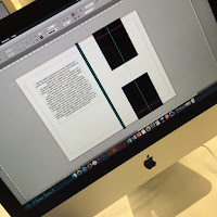
Today's process and production session with Rob was about extending our knowledge of Adobe Indesign. We had to put our thinking caps on and think of concepts for a design publication. From the lecture on deconstructing Helvetica, our work was scanned in so we can use for this session. Working in a group of 3, we created a design publication in black and white, included the interior pages of our designs working with the specified dimensions. This practices our designs and outputting client-ready PDF files with bleed and crop marks. Here are some images from the day:


Here is some of our initial sketches of ideas for the front and back cover of the publication. Working in the group of 3, we aligned ourselves tasks on specific areas to work on time. Below is an what we came up with having this simplistic style in mind. Using shapes on Indesign, we came up with a H abstract ensuring it's equally measured.


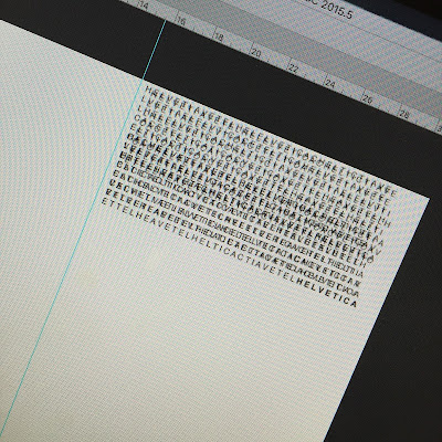
After looking at some inspiration of ideas, I thought the idea of this glitch code effect would be quite a cool style so I used The Matrix glitch as a reference for the idea below.


I liked how this looked because the text is spelling out Helvetica in a technical error order. I also had the text overlap so it gives it more of an effect of a glitch. I also ended the last line with Helvetica which is in Bold so it stands out. Overall, this session was interesting to play about and see each others work put together. It gave us the opportunity to work in groups which gets us all communicating as a team. It briefly helped me expand my knowledge on Indesign compared to the very beginning.


Kinetic Type 2 - (Z-Space)

In this After Effects workshop, we will be creating a Kinetic Type 3D space animation. We drew and brought in a set of song lyrics. I've selected the chorus for Earned It which was sung by The Weeknd. I selected this song because it linked with my essay and it brings my own interest of music into this fun workshop. I've drawn it out so it looks handwritten. Here is the drawn image of the lyrics:


Opening the scanned version on to Illustrator, I used the image trace tool to change the threshold. This enabled the lyrics to look and become more darkened, which looks more digitalised. Then I pasted that edited version on to Photoshop which was set up on the right pixels, working on 1920 x 1080. I began to start breaking up each word into layers. This is crucial for this to work because our video would be going through each word, through space.


So after having each layers all split up, I started looking for a free copyright background which I've screenshot and attached below. I selected this scrunched up look because it would look cool having the lyrics come out and move around on the page.


Preview of background with lyrics

After having all the components ready for this kinetic video, I saved my Photoshop as a PSD file and imported it into After Effects. After creating a new composition like in the previous tutorials, I placed all my layers and started to add animations to each layer.


Now the significant bit in this workshop is the use of camera in After Effects. Once I was happy with my text animations, I created this camera which enables us to control the direction the video is directing towards. After multiple editing time, Here is my final video below:

Song Tribute from Faisal Islam on Vimeo.

Tuesday, 11 April 2017

Manchester Trip

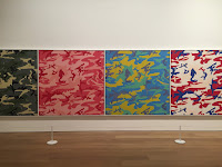
This Friday we headed over to Manchester with a coach to visit a few galleries. It's been a pretty decent trip and the gallery was interesting. There were some artists work that we could relate to such as Idris Khan who we've looked at during lectures. Here are some of my phone photography from the day:


Iconography

This is the final theory as practice lecture for the year. This was about Iconography. Iconography is Greek for image and to write. It's the study of symbols in a piece of work or design. These symbols are easily recognisable and is common through different cultures. For examples, an image of a dove, a white flag and a peace logo will all represent peace.

Here are an examples of Iconography that we associate with on our smartphones. These are symbols that are universal that we recognise and are aware of.


Appropriation Part 2

POSTMODERNISM AND APPROPRIATION PART 2:
Pastiche, Parody, Satire & Authenticity

Examples of parody, pastiche, satire in visual design as a way of achieving:
■ Humour
■ Political commentary
■ Critique
■ Layered understanding/engagement
■ Nostalgia


This graffiti is by Banksy which is an example of this postmodernism in 2006. This is actually an example of mockery that is made of Mona Lisa.

We look at adbusters and looked at some adverts that were anti-branding against certain cooperation's. 


This is an example of adbusters against Pepsi. I quite think it's an effective adbuster campaign because they just transformed the logo into a fat person drinking pepsi. There wasn't much to manipulate apart from adding a bellybutton. I think this worked really well because the white gap between the red and blue actually looks like a belly. Adbusters usually try to mock big brands but it's whether consumers want to take it on board or not.


Motion Graphics

This lecture was about Motion Graphics covered by Sara. This is pieces of digital footage to create the illusion of movement. You can create these motion graphic videos on After Effects which is our practice on the process and production module. It's a good practice to transform an idea into a visual moving video. Here is an example of motion graphics:


As you see, it's a pretty spectacular motion graphics clip using shapes to show the movement. It seems quite challenging to create but with some experimenting, you can actually produce a good piece of motion graphics work. This lecture overall was good on just over viewing the power of motion graphics and how it's used within the design industry,


Branding

It's the start of a new term and I am back all recovered from my tonsillectomy. This lecture is about Branding and we'll be looking at big cooperates that we all know. We started with a quiz on naming all these brand logos and it was pretty fun answering those.


A BRAND IS … A visual, emotional, rational image that you associate with a company or product – with an extremely powerful impact on our beliefs, behaviour and emotions.

I found this lecture interesting because I love looking at branding and how we associate a logo with a whole cooperate. It's interesting to see how they all differ from each other and how big a company is. We looked at many examples of ads, posters and idents and overall it was interesting learning about the theory behind branding.

The Vernacular

Lecture Notes:

The vernacular refers to the native language/dialect of a group. It will be recognisable as being the
language/dialect of this particular group and of a time and place. I.e. it has specific characteristics which identify it as different-sounding from other languages/dialects. So there might be a vernacular of Huddersfield, or of ‘the street’, or of those living in rural northern villages, etc. The significant thing here is difference – the vernacular suggest a subculture, as it exists in contrast to a main or dominant culture (in this example, a main or dominant language). When we extend this definition to visual design, we’re talking about a particular style or aesthetic which characterises a recognisable group, place, time. As above. Embodied in this ‘look’ is often a multitude of social, cultural and political (i.e. deeper) meanings which reflect the ideology or beliefs of that group/place/time – so it can be a useful and interesting tool for the designer.

Again, we might think of these as being subcultural styles when placed in contrast with the contemporary dominant aesthetic of professional) design. Sometimes the term is used more casually to refer to the appropriation (a key feature of Postmodernism) of ordinary commercial aesthetics/artefacts; an ‘everyday’ and/or ‘amateur’ aesthetic – the design of the general public rather than the professional designer. Things like shop front signage, food packaging, graffiti etc might fall into this category (many of the visual elements which were taken on board as a subject of interest by Pop Artists). Because it’s so recognisable and familiar, referencing a particular time/place so evidently, it becomes very quotable – designers using it know that it will be relatable and accessible to the viewer. Sometimes it is used to create a sense of nostalgia of fondness for the past – whether or not this is a real version of the past or an idealised one. In relation to Postmodernism, the vernacular is further interesting because while situating a dominant culture in contrast to a subculture, it can also be used in a way which combines the two and so blurs the boundaries between ‘high’ (avant-garde) and ‘low’ (consumer) culture.


This is an Italian example of Vernacular. These are a collection of images taken in Italy that represents the culture and style. It is very noticeable that yellow is used a lot in these shop signs.