Terry Eagleton came up with the quote "There is no reading of a work which is not also a re-writing" From this quote, I got the understanding that every individual will look at a piece of work and they will have their own interpretation and understanding of what they see whether it's a visual piece or a written piece. Therefore, this quote suggests that we have the ability to re-write existing work in our own ways, to our understanding.
Graphic Design = Visual Communication
Visual communication can be multiple forms of ideas that can be read or viewed. This includes signs, typography, drawing, graphic design, illustration, industrial design, adverting and animation. There's an exploration that a piece of work can visually communicate with or without text, and has the power to inform, educate or persuade the viewer. To put this into a bit of context, we tend to attract towards smaller chunks of text than a big block of text. It amazes me how the power of an image can be so powerful.
Furthermore, we looked at the concept of Praxis within design and I got the understanding that theory, history and practice work together as a hybrid; this is an ongoing cycle that we use when we design so that our work has a good purpose and meaning to be the best at communicating visually. I think that looking at the history of the subject helps in terms of trying to understand the concept and that will naturally flow within the design.
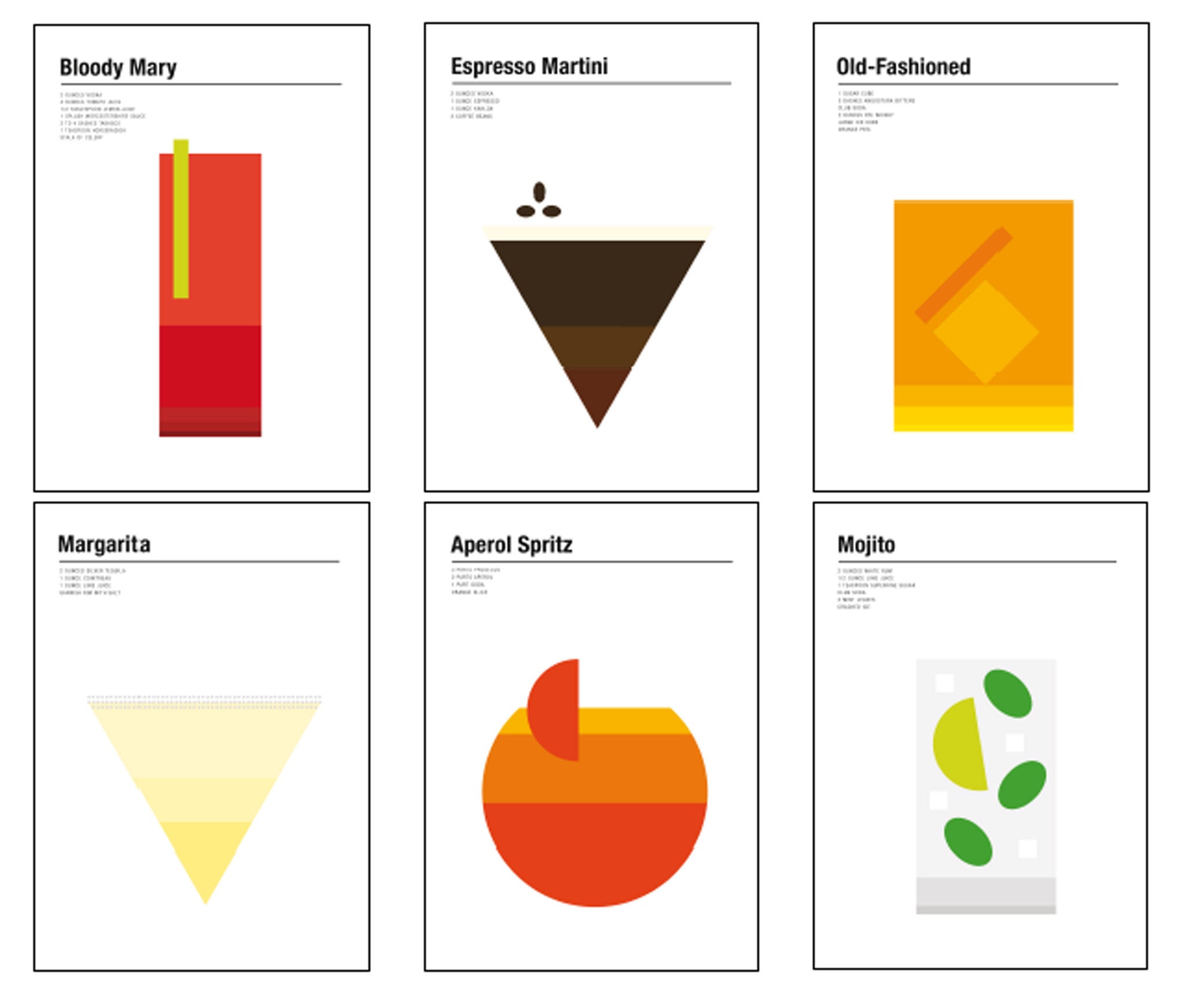
Another concept I found very interesting was about design authorship. This ties in well with having our own style and this could possibly be developed from praxis too. The idea of working with theory and practice could be a good way of developing your own unique style. Below is an example that I've found online which I thought was pretty eye appealing. This graphic designer named Nick Barclay created this similar styled posters about alcoholic drinks which has a simplistic aesthetics but yet represents each drink quite effectively.

http://www.independent.co.uk/arts-entertainment/art/features/graphic-designer-nick-barclay-breaks-down-classics-cocktails-in-his-minimalist-poster-designs-10361456.html
Furthermore, we looked at the concept of Praxis within design and I got the understanding that theory, history and practice work together as a hybrid; this is an ongoing cycle that we use when we design so that our work has a good purpose and meaning to be the best at communicating visually. I think that looking at the history of the subject helps in terms of trying to understand the concept and that will naturally flow within the design.
Another concept I found very interesting was about design authorship. This ties in well with having our own style and this could possibly be developed from praxis too. The idea of working with theory and practice could be a good way of developing your own unique style. Below is an example that I've found online which I thought was pretty eye appealing. This graphic designer named Nick Barclay created this similar styled posters about alcoholic drinks which has a simplistic aesthetics but yet represents each drink quite effectively.

http://www.independent.co.uk/arts-entertainment/art/features/graphic-designer-nick-barclay-breaks-down-classics-cocktails-in-his-minimalist-poster-designs-10361456.html
Afternoon Seminar
In this seminar, we looked at a design manifesto called "First Things First 2000" and we looked at what designers worked along. I couldn't get my head around it at first and I felt mixed emotions whilst reading this. From first impressions, I felt like this manifesto was leaning towards a negative vibe in the sense that commercial design was a bad thing. Instead of me selecting all the bad bits from this manifesto out and dissecting it into pieces, I decided to highlight some keywords that I thought defines graphic design to me. If I had to pick a word, I'd say "effective" is the most important factor because this could be interpreted in many forms. It could mean that this piece of design must stand out to people. It could also mean that there's a theory or logic behind it. Lastly, it could also mean it's effective without having a logic behind it, it's all about how we perceive a piece of work.
- Explore different avenues
- Begin with an idea
- Embrace simplicity
- Let it take you on a journey
- Tackle important issues along the way
- Plenty of fun and experiments
- Design without high expectation for the outcome
- Go with the flow
- Reflect and improve
